Dead Coloring
A few words about “dead coloring” and why it’s dead.
Historically, dead coloring was a Flemish underpainting technique widely used in the early Renaissance. The “dead layer” was always cool; it was applied on top of traditionally warm primer (raw umber? raw umber + yellow ochre?) to neutralize that warmth and establish value relationships.
However, Flemish artists did not invent dead coloring. Before them, Italians used something similar for fresco paintings. They even had a special term for it — Verdaccio — that referred to a specific mixture of pigments as well as the technique itself. The Italian Verdaccio was a neutral color, brownish/yellowish/greenish gray, a mixture of black (bone black, I assume, but not sure), white, and yellow. Color was applied later on top of it.
But why, why dead coloring?! Notice how both Italian and Flemish artists did not use actual colors in the “dead” layer. It was a strictly tonal underpainting. The choice of green-gray was not an accident. Even fresco painters of the early Renaissance knew that flesh tones were one of most challenging aspects of painting in color. They used soft green-gray Verdaccio to downplay the intensity of orange and pink (applied later on top of the “dead” layer) to make skin look more realistic. So, dead coloring was an underpainting for a figure before the “life” of color was added to it.
Figures of dead or dying people (e.g. Christ on a cross) were often left in Verdaccio, so it literally was the color of dead flesh.
Here’re some examples.
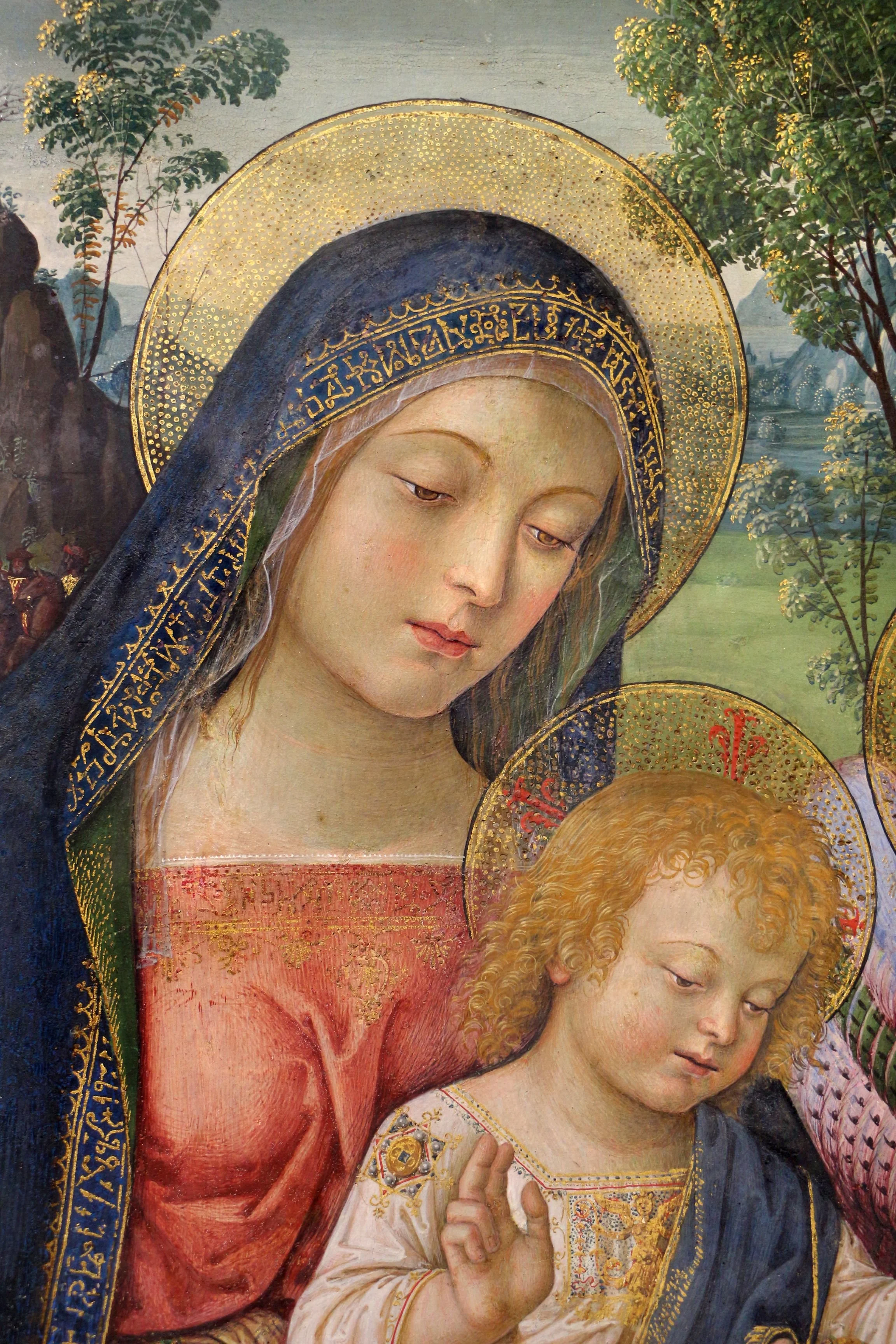
Madonna of Peace by Punturicchio (late 15th century). You can see Verdaccio in the background and showing through the transparent layer of pink on the skin.
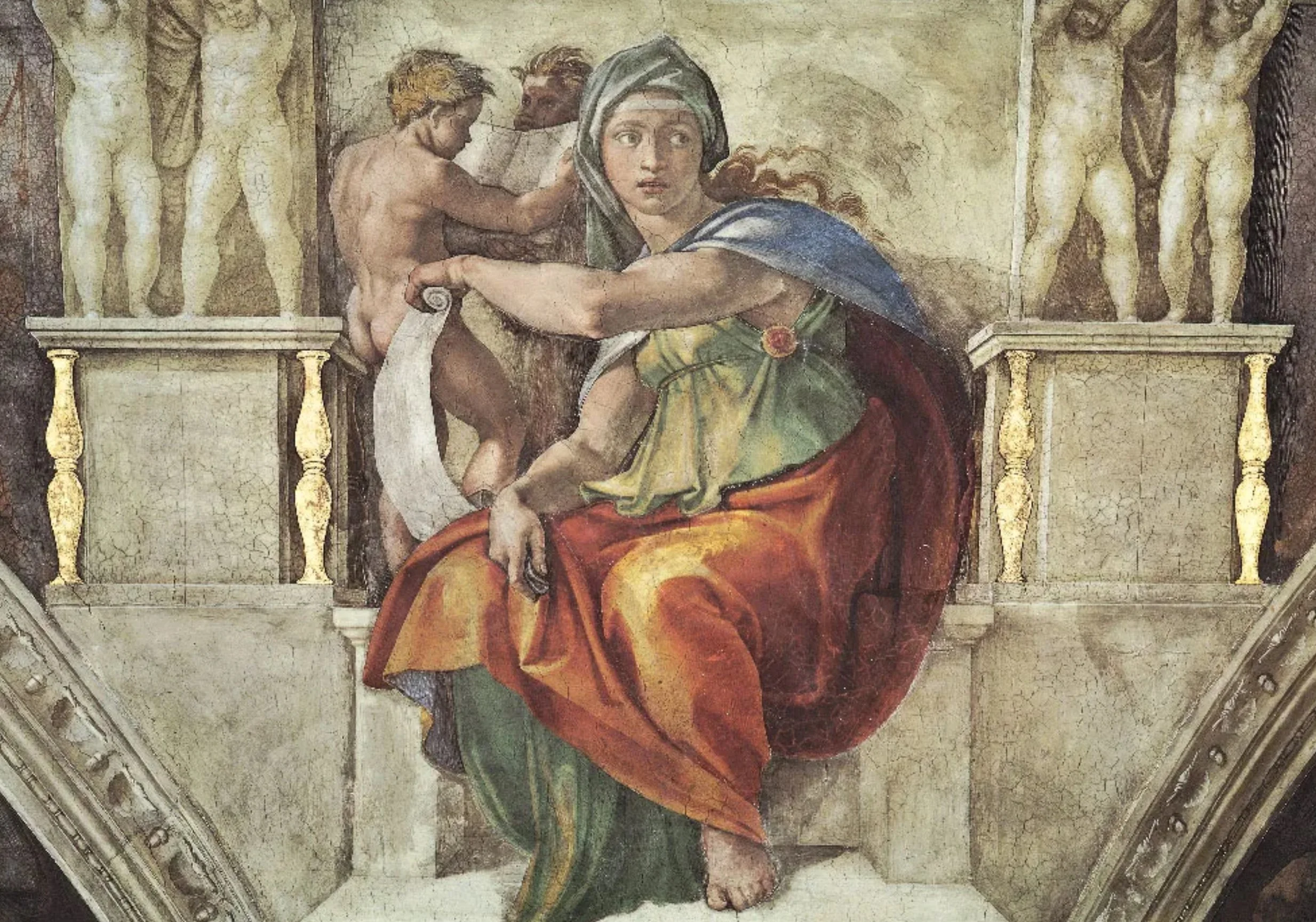
A section of Sistine Chapel (I assume everyone knows the artist). Also late 15th century.
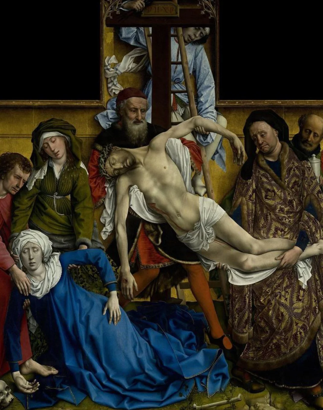
The Descent from the Cross by a Flemish artist Rogier van der Weyden (mid 15th century). Notice the color of Christ’s skin. The inverted T composition with a taller center part was typical of altarpieces. Indeed, this painting was commissioned for a chapel.
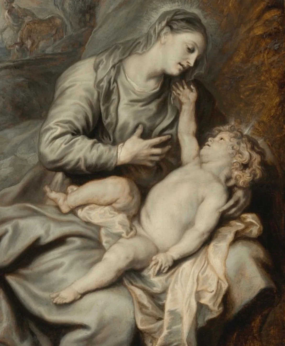
Madonna and Child with Rest on the Flight into Egypt by Anthony van Dyck (early 17th century). Notice the previous layer, the warm imprimatura, showing through the cool dead coloring. (The baby… well, it might not have been van Duck’s finest hour, but he still was an amazing artist).