How to Read Paint Labels. Demystifying the Complexity of Oil Painting
Below is a text of my lecture at ARA Boston
An artist who I consider my mentor/a person who happened to be in the right place in the right time of my life used to say: master your subject, master your medium, then do whatever you like. Hence, today’s lecture is about mastering your medium, which is rarely discussed here. You hear and read bits and pieces of information, and it feels like a lot and sounds very complex, but we rarely get to basics. Without getting too technical and scientific, this talk is my attempt to make sure we know our paints, what to expect of them, how to buy them, and where to find that information. I assure you, it is right at your fingertips! We shall talk about what you can find on professional-grade paint tubes and what to do with it. BTW, it refers not only to oils, but to other types of paint as well, regardless of the vehicle, be it gum arabic (watercolor), polymer emulsion (acrylic), or egg yolk (tempera).
As a side note, I have noticed that watercolor paint manufacturers are more generous with information on paint tubes, while oil paints tend to be more mysterious. Fear not, you can usually find all this info on a manufacturer’s website.
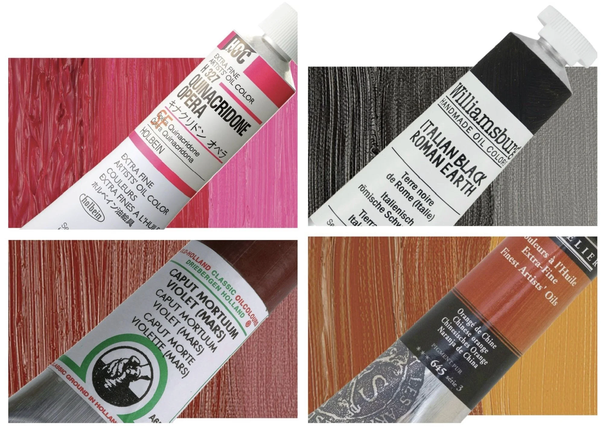
Manufacturer’s paint name. Oftentimes manufacturers would get rather creative and come up with names that have very little to do with the actual pigments, e.g. Italian Black Roman Earth, Quinacridone Opera, Caput Mortuum Violet, Chinese Orange.
However, some parts of the name can be informative. For example, the word “hue” indicates that a color is achieved using alternative pigments instead of traditional ones. That can be done for a number of reasons: safety (original pigment is toxic), rarity, cost, stability.
Cadmium Red Hue (PY73 — Arylide yellow, PR112 — Naphthol red) is made of organic pigments and is less expensive and less toxic than traditional cadmium red PR108, which is a heavy metal.
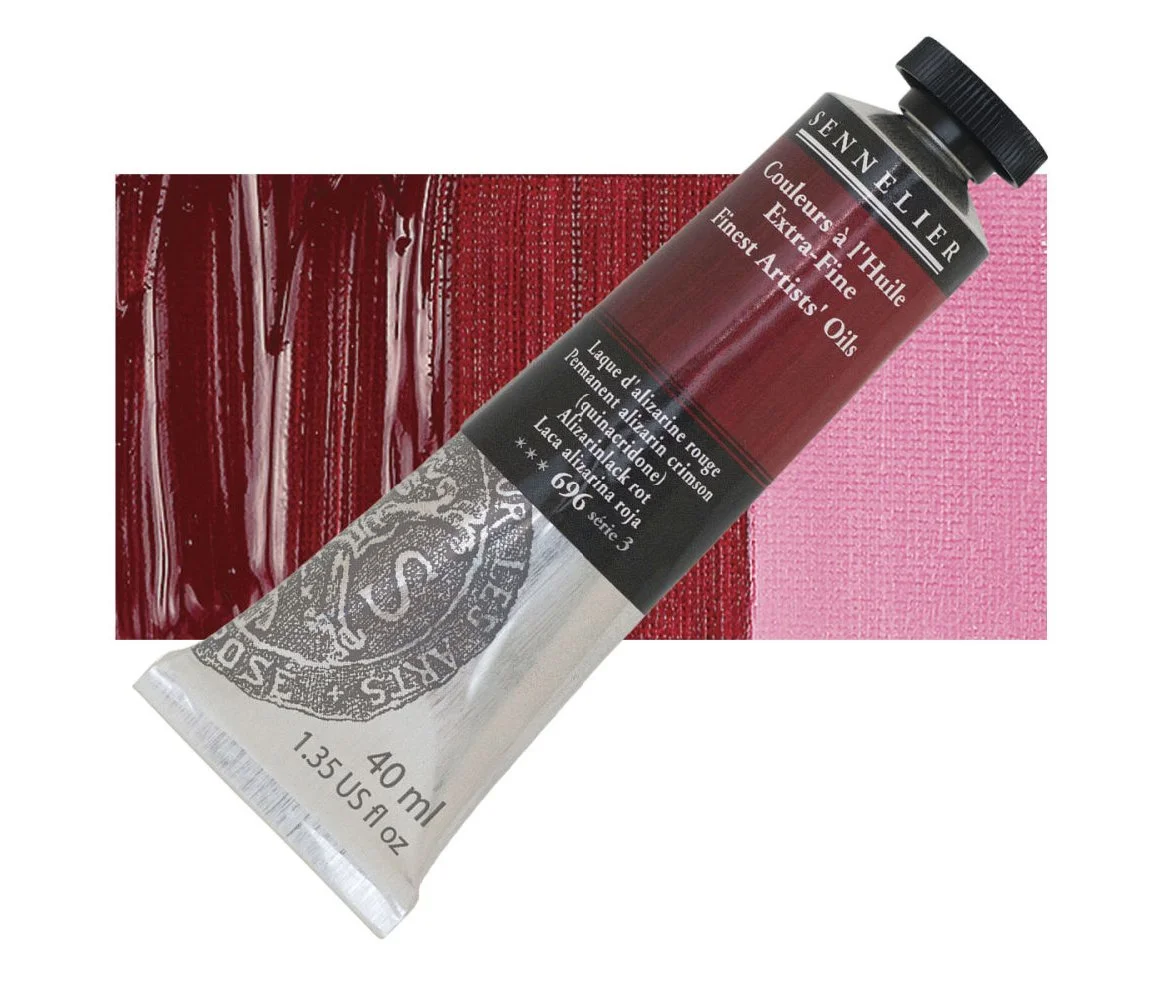
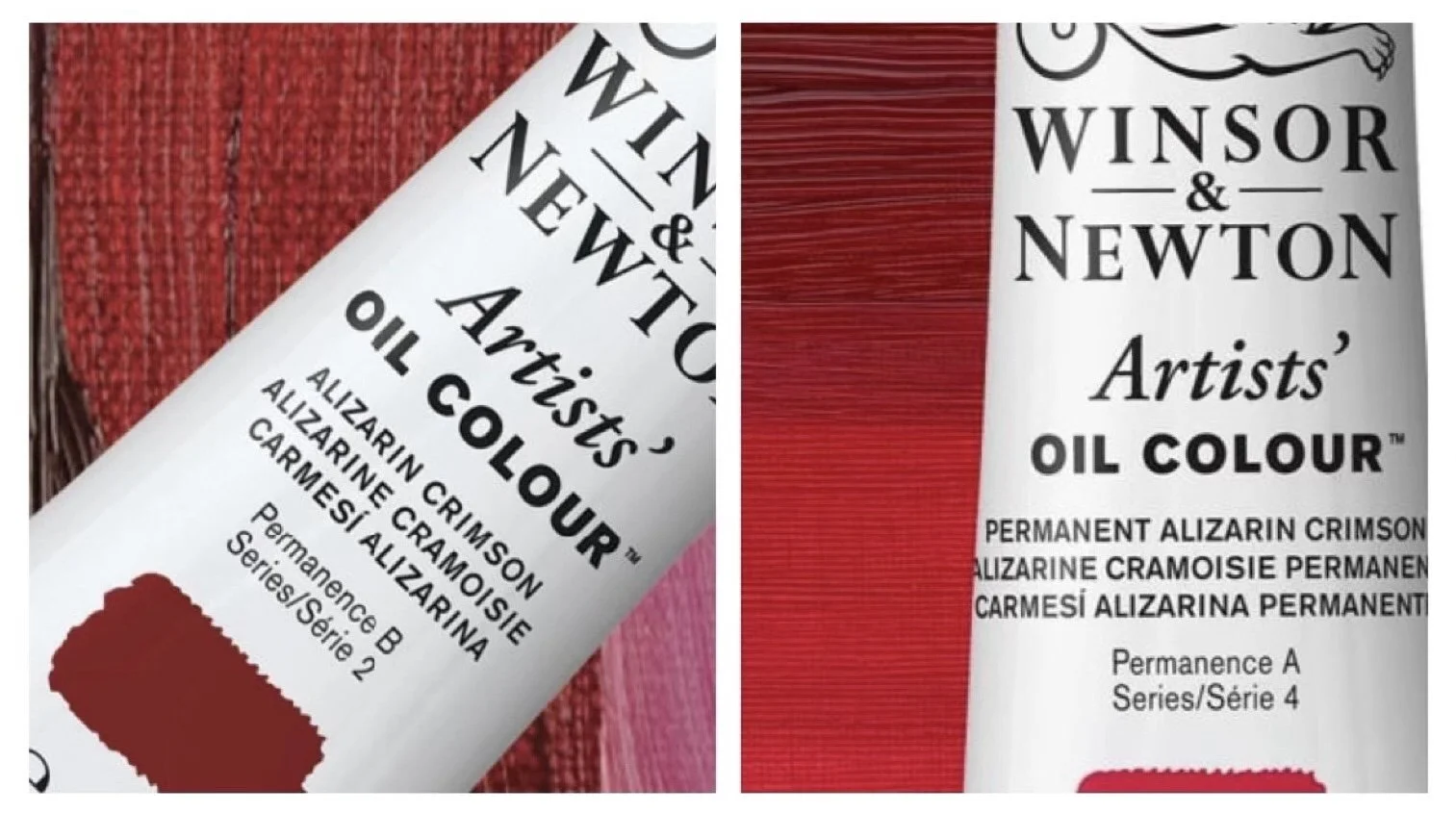
The word “permanent” indicates that a traditional pigment —in this case alizarin crimson PR83 — has been replaced with a more stable one with better lightfastness (we shall touch upon lightfastness later).
Permanent Alizarin Crimson (PR202 — Quinacridone magenta, PR209 — Quinacridone red, PR179 — perylene maroon).
WHY DOES IT MATTER? First, the price may be different. Second, even though the replacement colors are supposed to be the same as original ones, you can notice differences. I my experience, Alizarin Permanent is bluer and less chromatic in mixtures than genuine alizarin.
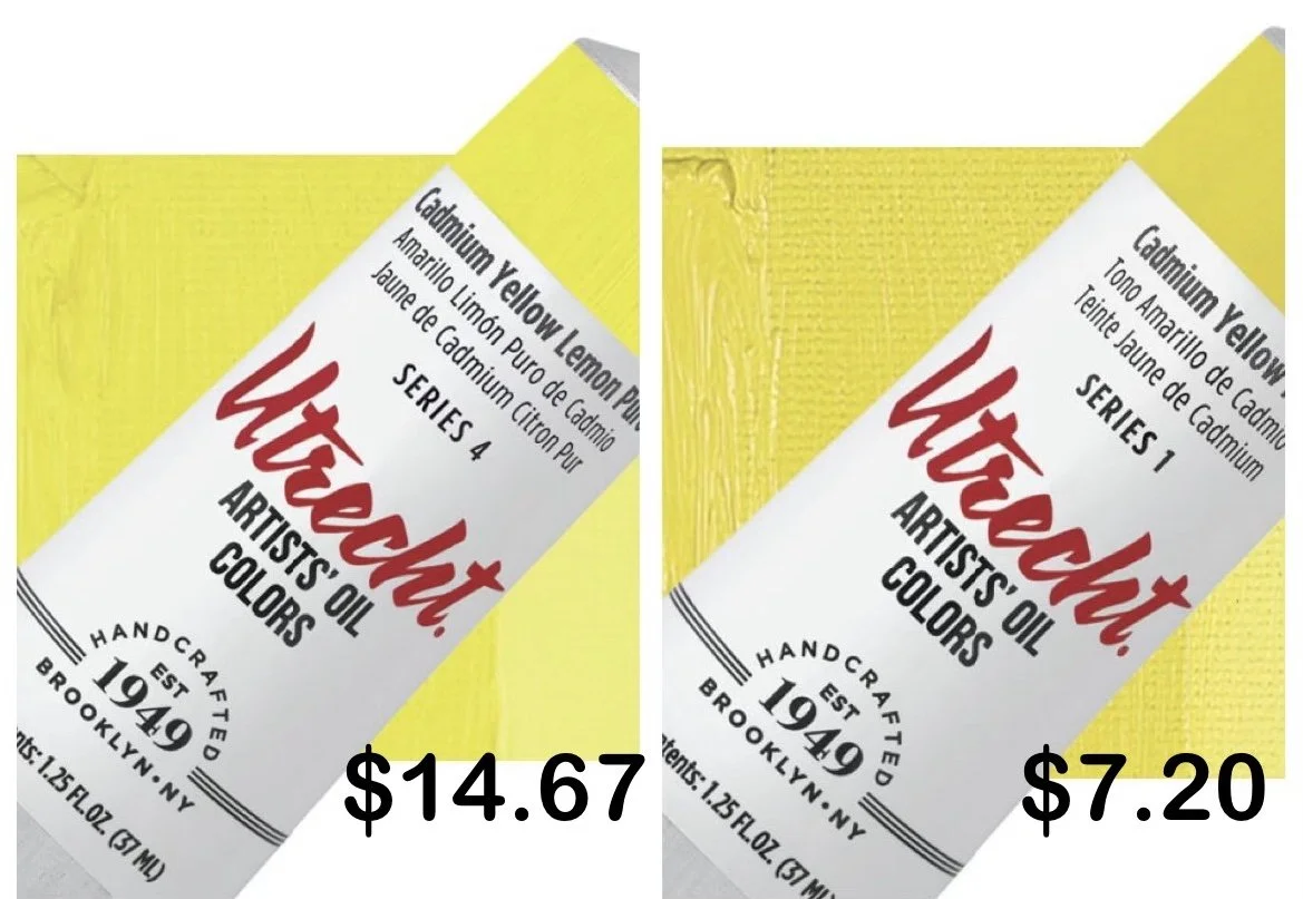
Series. No mystery here, series refers to paint price, lower numbers indicating less expensive pigments and higher number being pricier.
Here’re 2 cad yellows, but they are not exactly the same (prices from Blick 2024).
Series 1 — $7.20 for 37 ml, PY73 (arylide yellow) + PW4 (zinc white)
Series 4 — $14.67 for 37 ml, PR37 (cadmium sulfide)
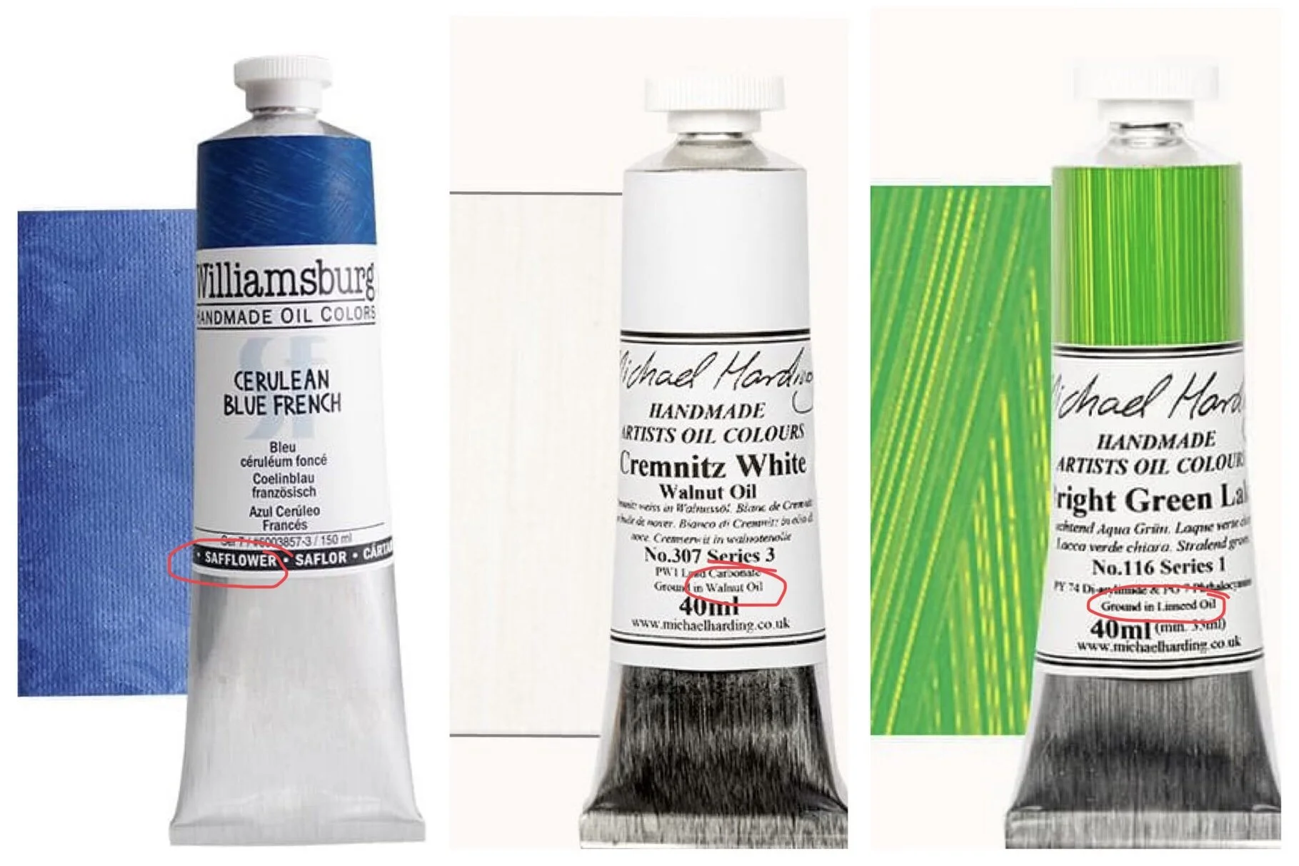
Vehicle is the liquid that holds pigment particles together and allows the paint to be spread evenly on the surface. Vehicle acts as binder. It can be polymer emulsion (acrylic), gum arabic (watercolor), or oil. The question is what oil.
WHY DOES IT MATTER? Different oils have different properties. The most commonly used one is linseed oil, consider it you defaults option. Walnut oil dries slower, so your paint stays “open” longer thus allowing for easy reworking of a layer while the surface remains wet. Might me a good option for Alla Prisma painting. Safflower oil is also slow-drying; it tends to yellow less than other oils so might be preferred for lighter colors.
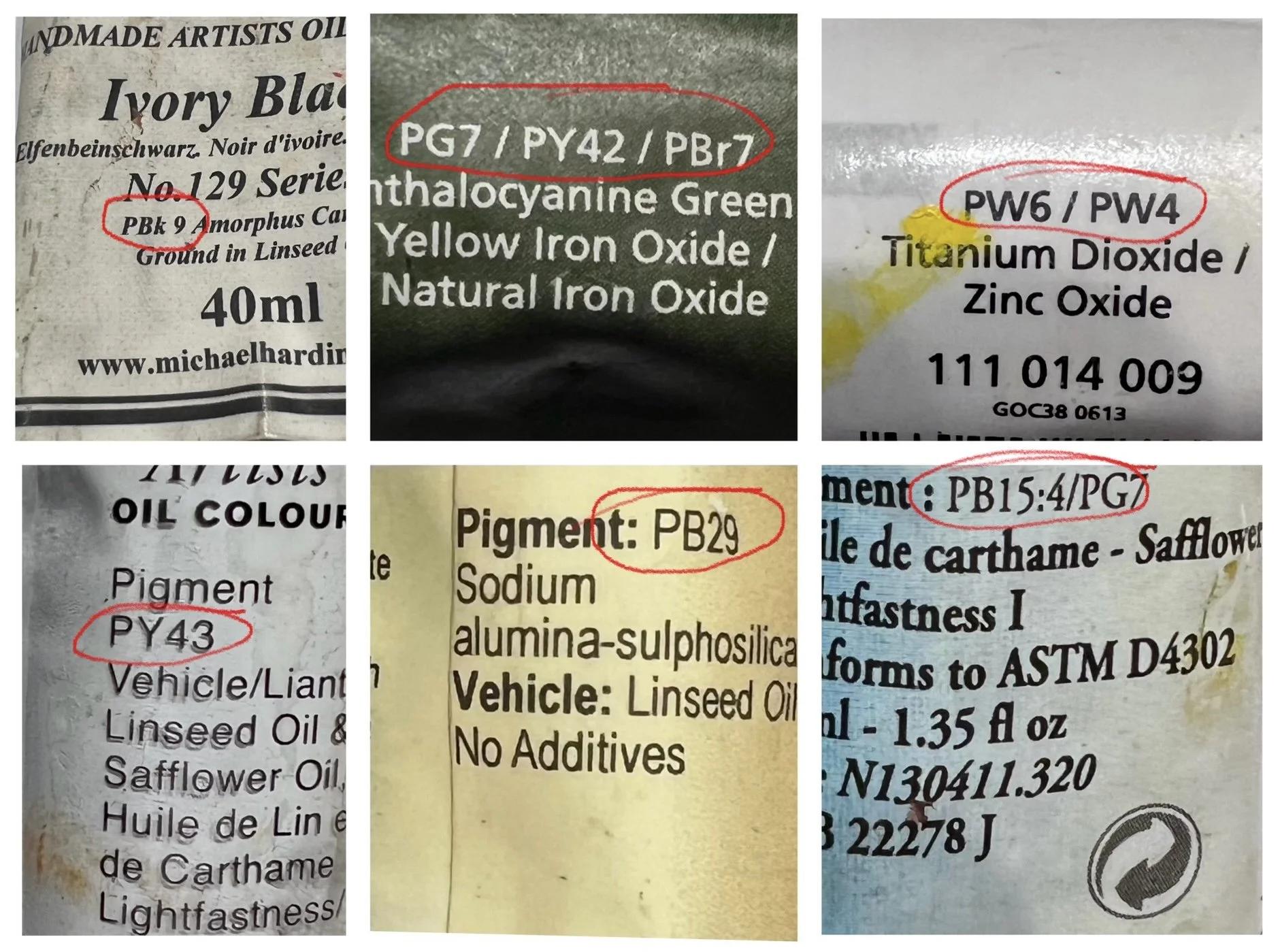
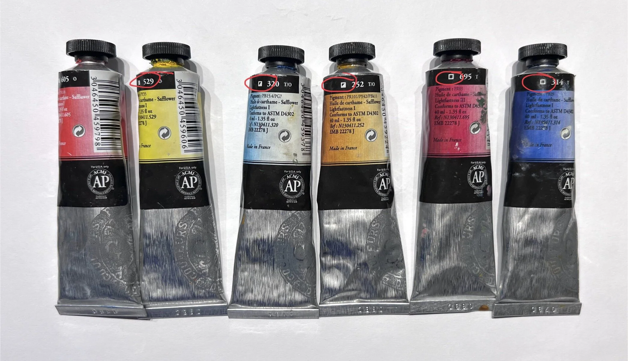
Pigment. You can usually find an alphanumeric code for pigment on all paint tubes. Pigments are the actual colored components of paint. Most modern pigments are mineral or synthetic; some can be plant- or even animal-based, e.g. sepia used to be made of cuttlefish ink.
Photo of pigments from Rembrandt’s House Museum, Amsterdam
A few words about pigments, since they are the most important part of our paint. There will be no slides, you don’t have to know all of this, consider it a piece of trivia that can potentially be useful.
Mineral, or inorganic, pigments are created by combining and heating naturallly occurring elements, they often contain metals and/or metallic compounds. As a rule, mineral pigments are opaque or semi-opaque and have descent lightfastness characteristics. All earth pigments — ochre, umbers, siennas — are mineral. All metal-based pigments — cadmium, cobalt, lead, titanium — are mineral. No glazing.
Synthetic pigments are sometimes referred to as organic. The word “organic” has nothing to do with Whole Foods: think organic chemistry and organic compounds, i.e. substances containing carbon-hydrogen bonds. Most things around us are polymer organic compounds (plastics, synthetic fabrics, etc.) If you see an unpronounceable pigment name like quinacridone or phthalocyanine it is most likely organic. Organic pigments are often — but not necessarily — more chromatic, translucent, and must be checked for permanence. An example of a naturally occurring organic pigment that we frequently use is alizarin crimson (PR83), and it is fugitive.
The letters in pigment codes stand for color families: red (PR), blue (PB), yellow (PY), violet (PV), brown (PBr), white (PW), and black (PBk). Well, white and black are not exactly colors, but there’re white and black pigments.
WHY DOES IT MATTER? Pigments with the same alphanumerical code have the same chemical composition and produce the same color, regardless of manufacturer (I’m not going into particle size, dispersion process etc. here). So if you are getting cadmium red light (PR 108) it will be the same color, regardless of the brand. Or at least that should be the case theoretically. In practice, some pigments, earth pigments in particular, can vary pretty noticeably depending on their place of origin.
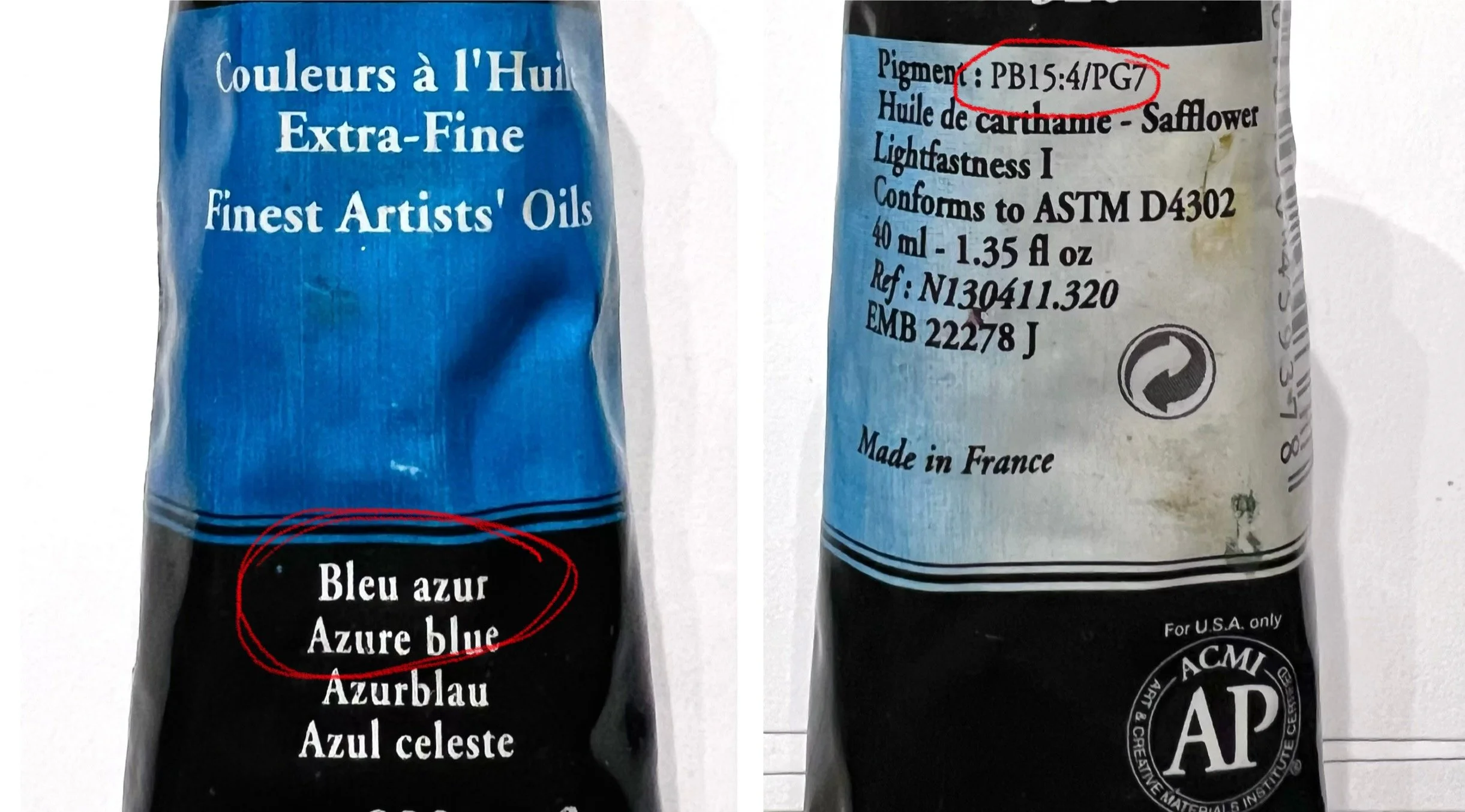
If you know the qualities of the most common pigments you can predict the color and how a paint is going to behave just by looking at the tube. Here we have something under a pretty name “blue azur”, maybe that’s some special paint we can use to nail the color of summer sky on a sunny day… No, it is just garden variety phthalo blue and green.
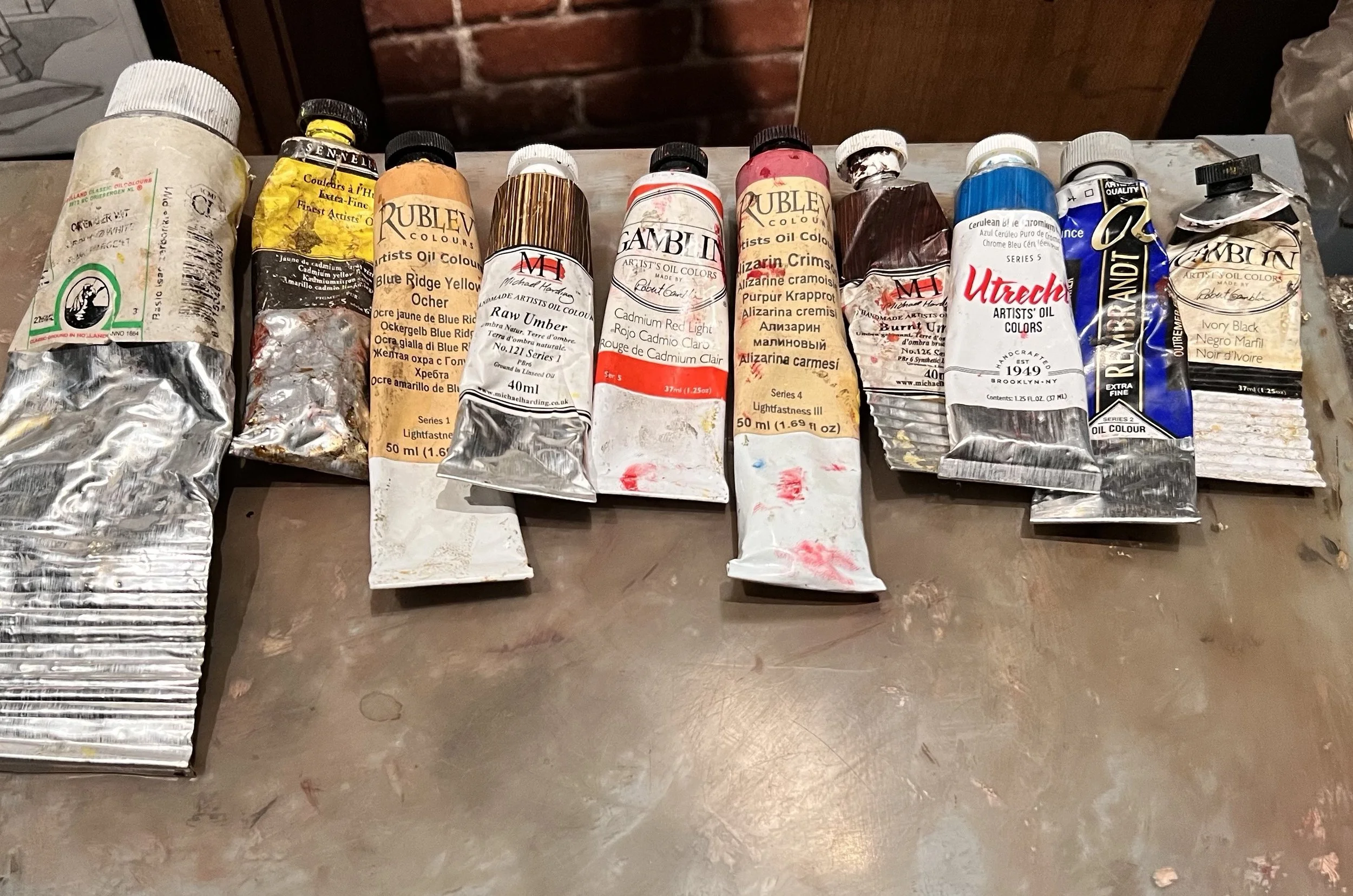
It’s a good idea to pay attention at the number of pigments in a paint. Single-pigment paints are better for mixing, they are more predictable, while paints with several pigments can produce dull and “muddy” colors when mixed. Notice that all 10 paints in my “standard” palette are single-pigment.
BTW, you do not need to know pigment codes by heart, there’s a database you can refer to.
Opacity/transparency. Opacity is hiding power, the ability of a pigment to obliterate the surface underneath. Some pigments are more opaque than others. The key factor in opacity is not color per se, nor value, but rather an ability to scatter light, or a pigment’s refractive index (how much light’s speed changes when it passes through the pigment). Relatively dark pigments can be transparent (e.g. ultramarine), and light ones can be opaque (e.g. all whites, cadmium, etc.). All metal pigments are opaque, they reflect light and do not let it travel through and get bounced back from the surface underneath.
From the practical viewpoint it means the following. Opaque paints have a more dense appearance. When applied thinly they appear somewhat chalky. Transparent pigments are great for layering/glazing. Their chroma increases slightly when they are used in a glaze.
Lightfastness (permanence) is the pigment’s ability to resist fading when exposed to light. To put it simply, some pigments fade more than others, they are called fugitive. It has nothing to do with their quality or price (even high-quality pigments fade). All it means that your artwork needs to be protected from direct sunlight. Most modern paints are relatively lightfast. The only somewhat fugitive pigment in our standard palette is alizarin crimson.

